
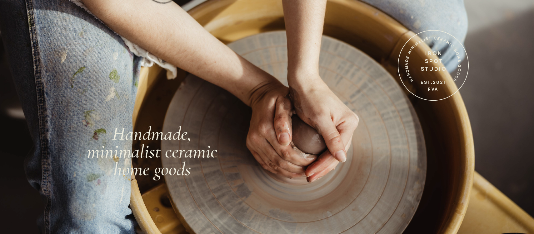
Iron Spot Studio
Handcrafted Ceramics in Richmond, Virginia

We helped Iron Spot Studio with:
Content Strategy
Logo & Brand Design
How It Started…
It’s not often that we get to create the very first iteration of a brand, but with Iron Spot Studio, we did!
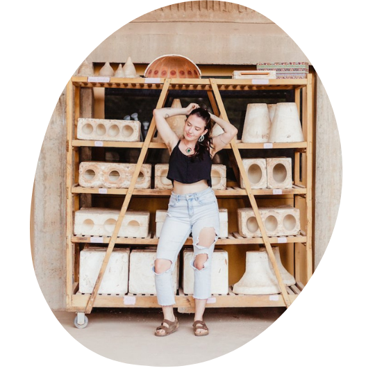
Shannon, owner of Iron Spot Studio came to us ready to make it official — she had officially formed her LLC and was ready for strategy and a visual brand identity. Even though Iron Spot was brand new, Shannon still had a clear idea of what she wanted her brand to convey and who it was talking to.
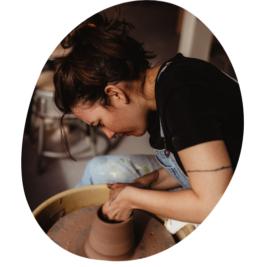
Photos of Shannon by Jessica Jameson
Time for a Artful Rebrand
We kicked off our branding project the way we kick off most projects — with a questionnaire. We always work to get a sense of who a brand is and Shannon made sure it was perfectly clear:
Recipe for Iron Spot Studio as a person: One whole Audrey Hepburn, off-screen, effortlessly elegant, casually classic and timeless, sophisticated but youthful. A pinch of Morticia Addams, love of witchcraft, darkness, and utter seduction
If that doesn’t give you a distinct vibe, we don’t know what will.
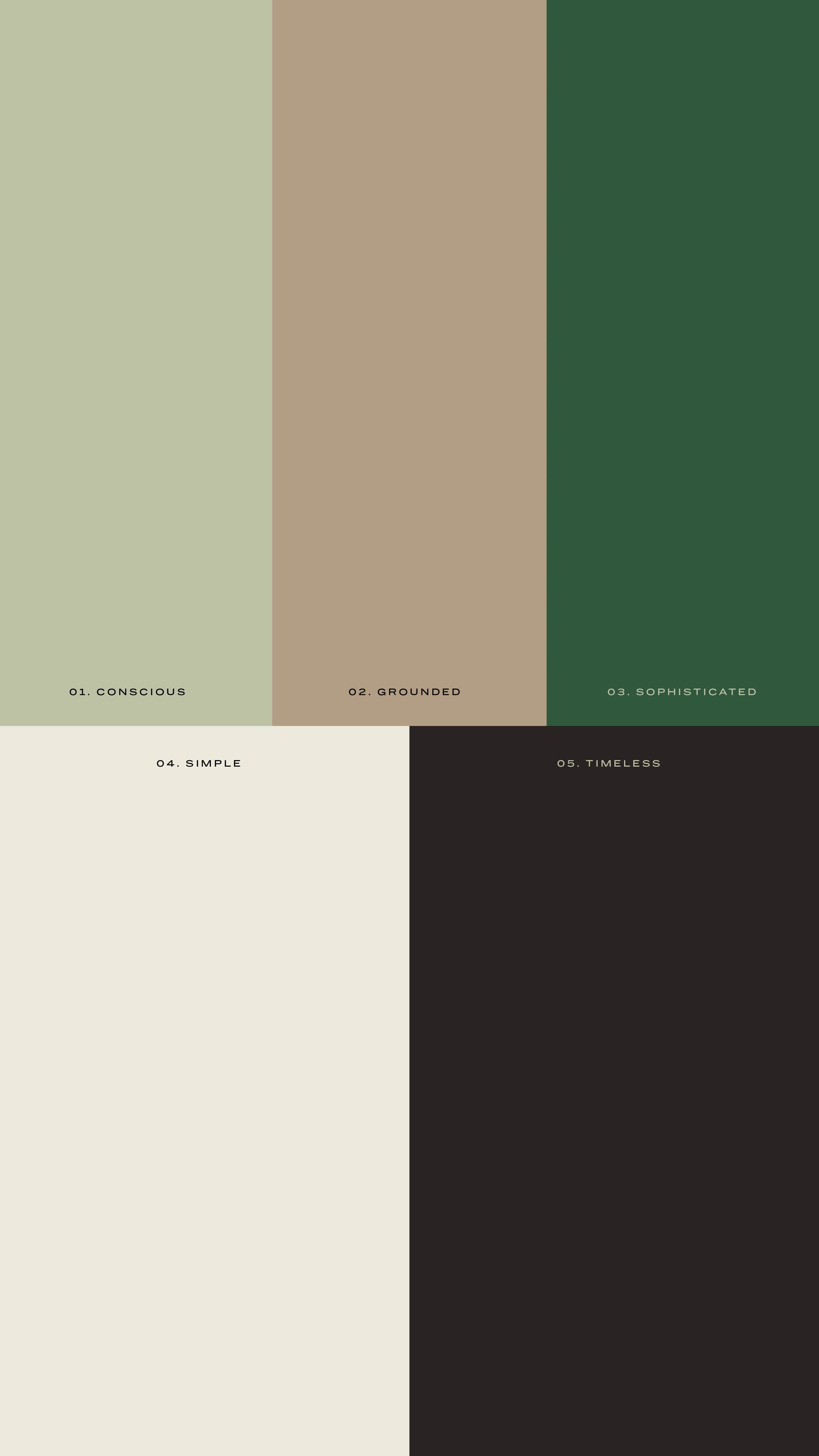
In addition to taking into account who Iron Spot would be if it were a person, we had to keep in mind the actual ceramics that Shannon makes — they’re minimal, simple and environmentally and socially conscious.
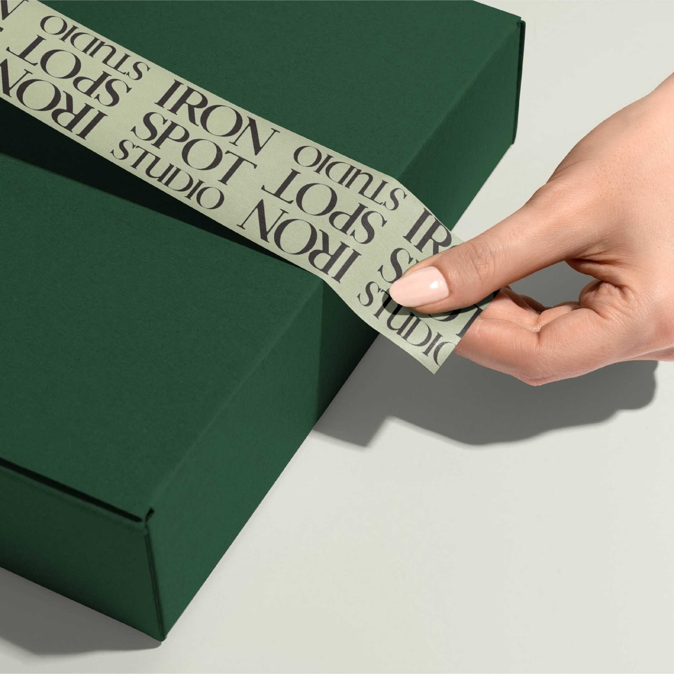
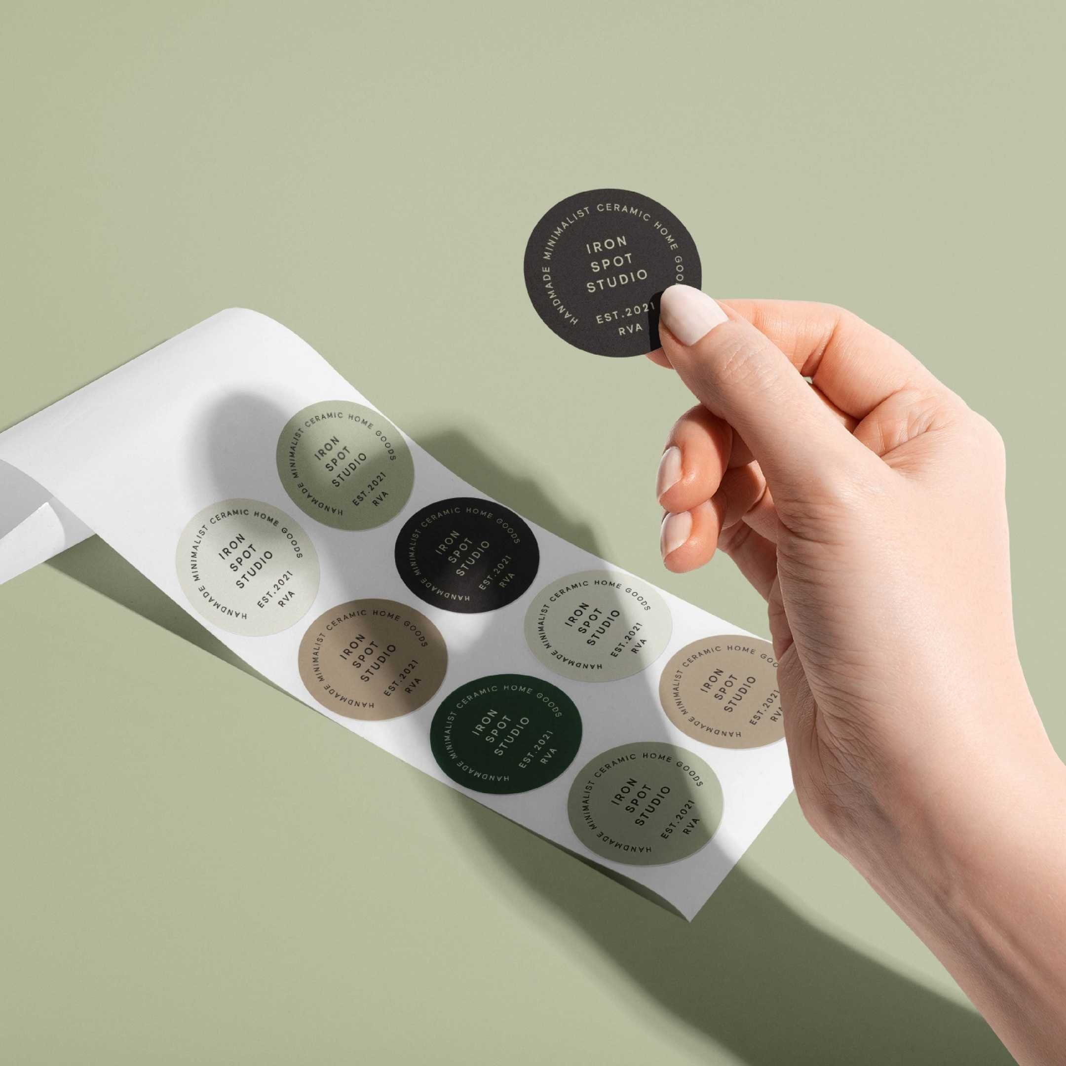
Keeping all of that in mind, our lead designer, Carly, created a word mark logo that has an almost craftsman look and feel to it. Additionally, Carly was able to pull a texture off of a piece of ceramics that Shannon made, turned it into a vectorized pattern and used it in one variation of the logo. Despite the fact that there are multiple variations of the Iron Spot logo, they all feel cohesive. When the VVITCH team designs a brand, we always keep in mind the various places in the world (both IRL and digital) that a brand might show up. Doing this allows us to create assets that will serve our clients for years to come.
The palette that Shannon chose is calm, refined, and earthy. The mixture of neutrals and greens conveys a balance between grounded organicism and high value.


"Starting my first LLC business felt like a mountain I couldn't climb by myself. I could never have imagined making it a reality until I found WITCH Digital. Their support and guidance has been invaluable and I have received so much more than a beautiful branded logo. They listened to all my concerns and worked with me through the details of translating an abstract idea into a concrete identity and the result is stunning."
— Shannon Mackenzie