Justin McCallum Photography
Wedding & Portrait Photographer in New York City


We helped Justin with:
Logo & Brand Design
How It Started…
Justin was ready to level up his branding to attract a different caliber of client when he came to VVITCH Digital. He said that the reason he approached VVITCH when he did was “because I haven’t been able to figure [my branding] out myself, and I need a kick in the butt! I also feel like I know what I like and don’t like, but have a hard time making decisions or feeling confident enough in myself to choose anything.”
This is one thing that comes up a lot for clients, especially those going through a rebrand — they might know what their personal preferences are, but they have a hard time making strategic decisions about their branding.
“The goal (both personally and professionally) is to be David Rose (and Dan Levy)…I love the graphic, sleek yet lived in quality of his sense of style, that he cares so much about things yet doesn’t take himself too seriously. I also really admire and strive for his celebration of queerness and idealism” Justin told us. With all of the information Justin shared with us, our lead designer got to work.
Photo of Justin by Leah Weinberg of Color Pop Events

A Colorful & Bold Rebrand
The logo that we landed on for Justin McCallum utilizes clean sans-serif fonts with a crisp, confident feel. The primary font used is bold and to-the-point, and the supporting font used for the strapline is casual and light, so as not to compete with Justin’s name. The result is simple and clean, yet unique.
This set of typefaces that our designer chose represents the bold yet approachable feel of the Justin McCallum Photography brand.
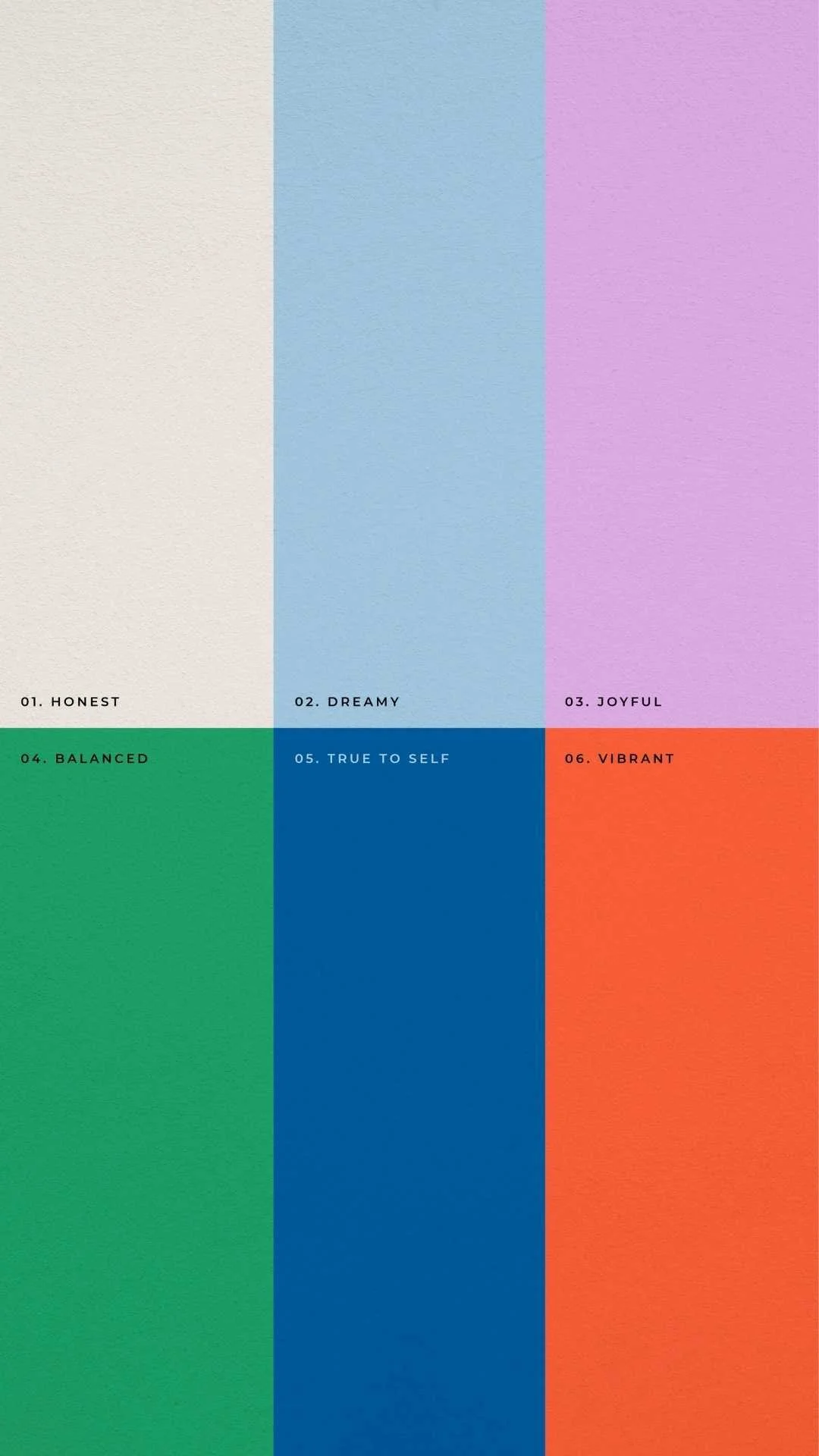
We love an expansive color palette and this one does not disappoint. The palette shown here is varied, lively, and joyful. The mixture of bright tones & muted pastels conveys a balance between fun & professionalism, and the inclusion of a true black brings a bold contrast that conveys confidence.
This new branding will not only help Justin attract his ideal clients, but is also a better reflection of Justin as a person. As a service-based business, this is a key component.